
Overview
Bloom was created during the pandemic to make buying houseplants as simple as ordering food online.
The ambition wasn't to build another plant brand. It was to create something fresh, optimistic and digital-first, combining the warmth of nature with the clarity of modern app design. My role was to develop a visual identity that felt clean, playful and instantly recognisable across every customer touchpoint.


The Challenge
Bloom wasn't just selling plants, it was reimagining how people buy them.
The identity needed to feel as intuitive as the product itself, blending the warmth of nature with the simplicity of modern app design.
How do you make plants feel digital?
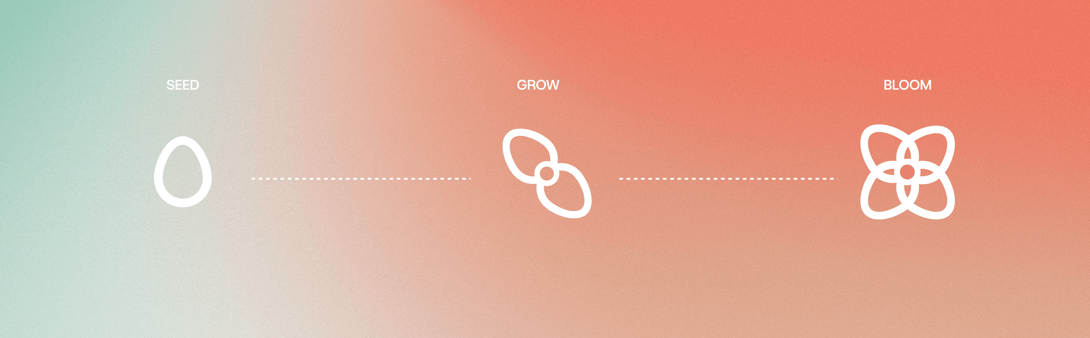
That question shaped every decision, from the clean typography and vibrant colour palette to a custom leaf pattern that forms the Bloom icon, creating a brand that's playful, contemporary and unmistakably Bloom.

Clear & Clean
The identity was designed around clarity.
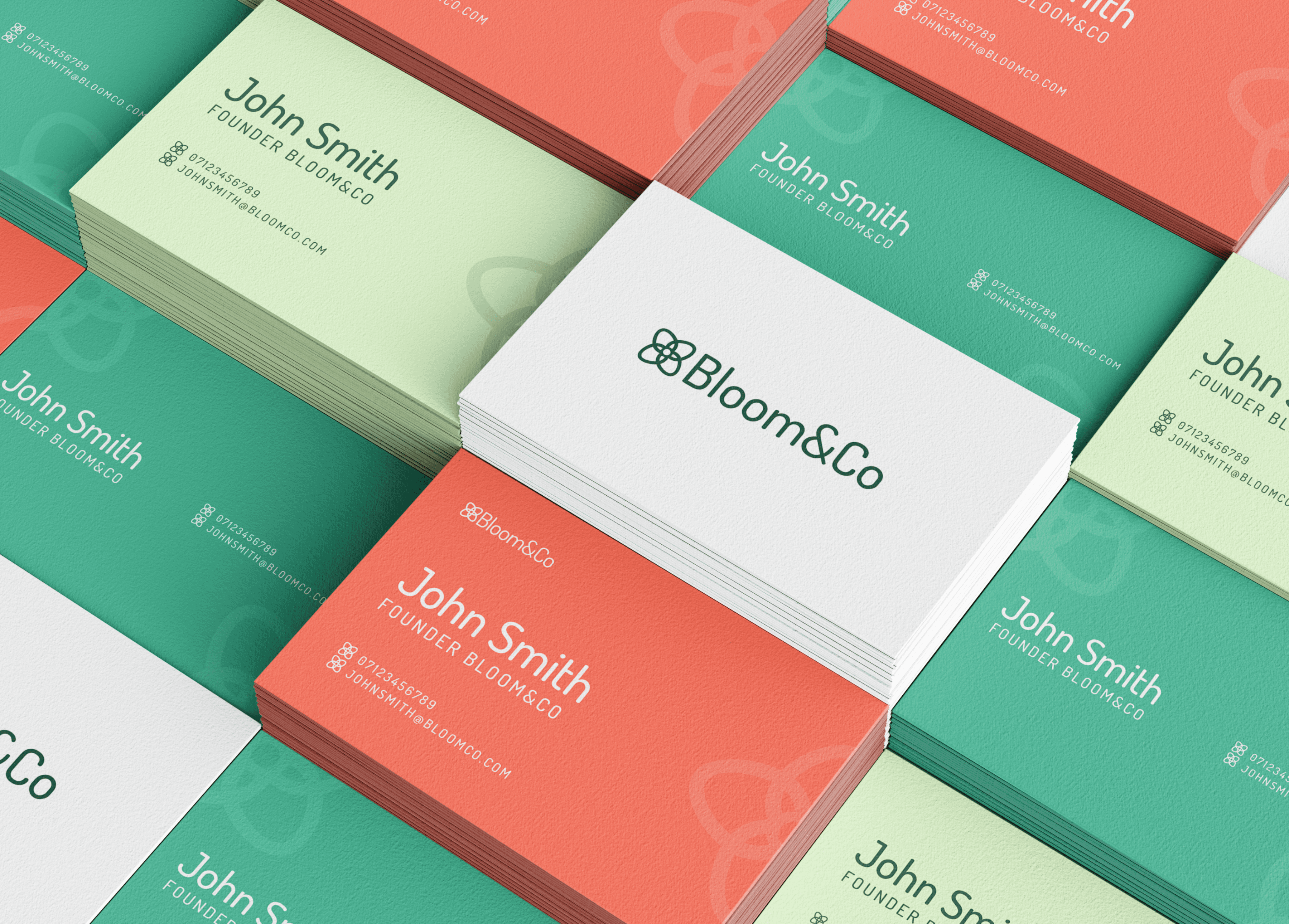
Flat graphics, generous spacing and a minimal visual language allow the brighter elements to do the work, creating a brand that's playful without feeling cluttered. The result is an identity that feels equally at home in an app interface, on social media or across printed marketing materials.

Building Foundations
Alongside the visual identity, I created a comprehensive brand system covering logo usage, colour, typography, layout principles and supporting graphics.
The system was applied across business cards, marketing materials and social templates, giving Bloom a consistent identity that could evolve as the business expanded.

