
Overview
MIDOM helps organisations manage integrity and regulatory risk from a single platform.
Instead of tracking governance across spreadsheets, email and disconnected tools, it gives risk teams one place to assess, score and monitor risk, while giving boards a live view they can trust.
The goal wasn't simply to digitise an existing process. It was to make complex governance information easier to understand, so organisations could spend less time interpreting data and more time acting on it.

The Challange
Risk managers and board members rely on the same information, but they use it in completely different ways.
Risk managers need speed, precision and a complete audit trail as they investigate and assess individual cases. Boards need confidence. They're accountable for decisions, but don't have the time or the need to work through every detail. The challenge was designing one platform that supported both groups without compromising either experience.
The product was built around one simple principle: Information flows one way.
Risk teams investigate, validate and approve every assessment before it's shared with the board. Directors never see work in progress, only trusted information that's ready to support decision-making. For risk managers, that meant fast case creation, objective scoring and a transparent audit trail. For boards, it meant a live, read-only view that answered one question immediately: How exposed are we right now?
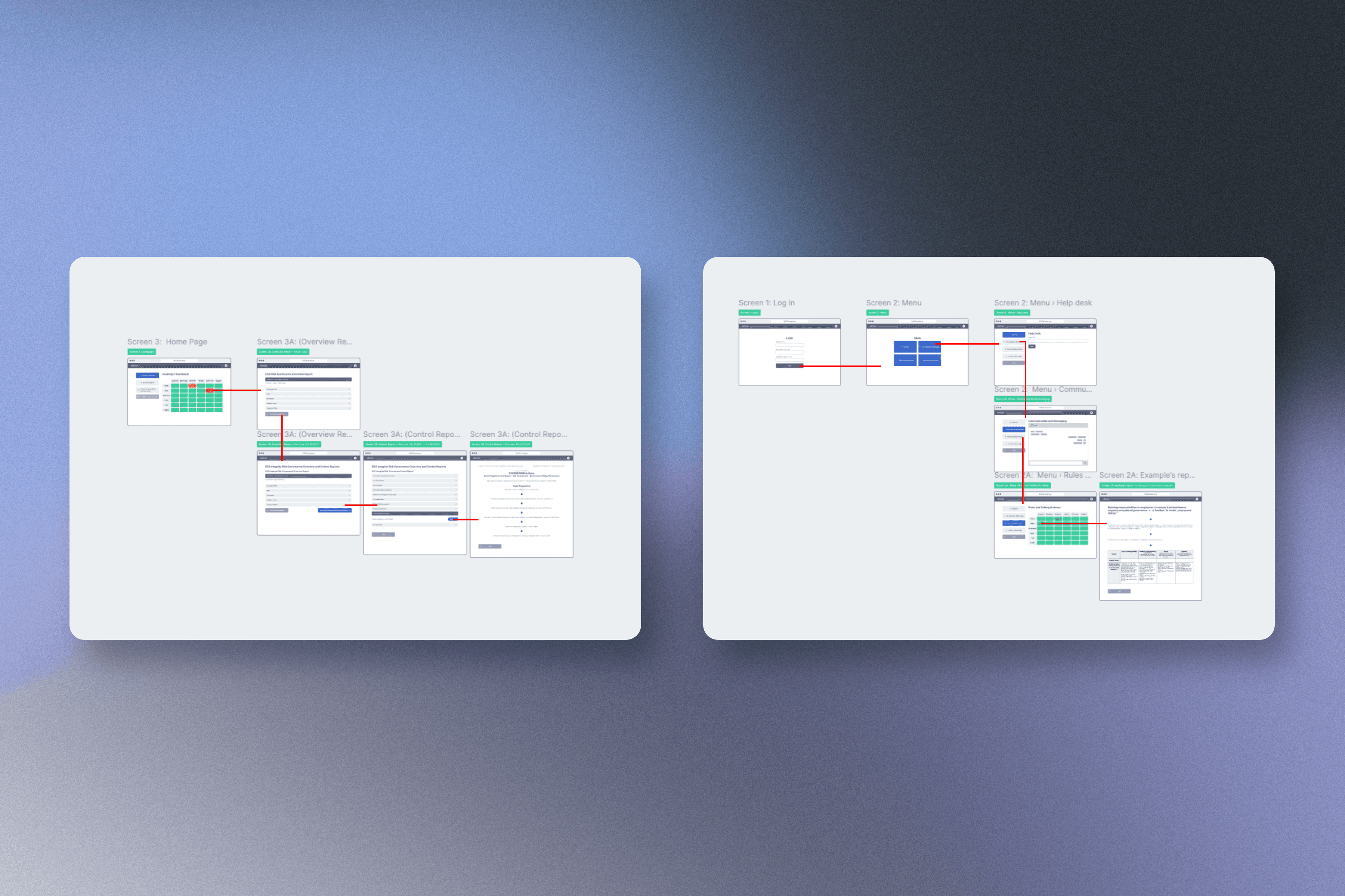
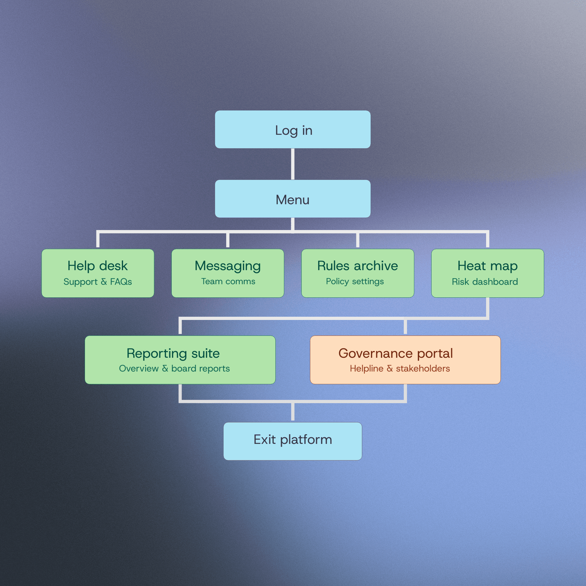
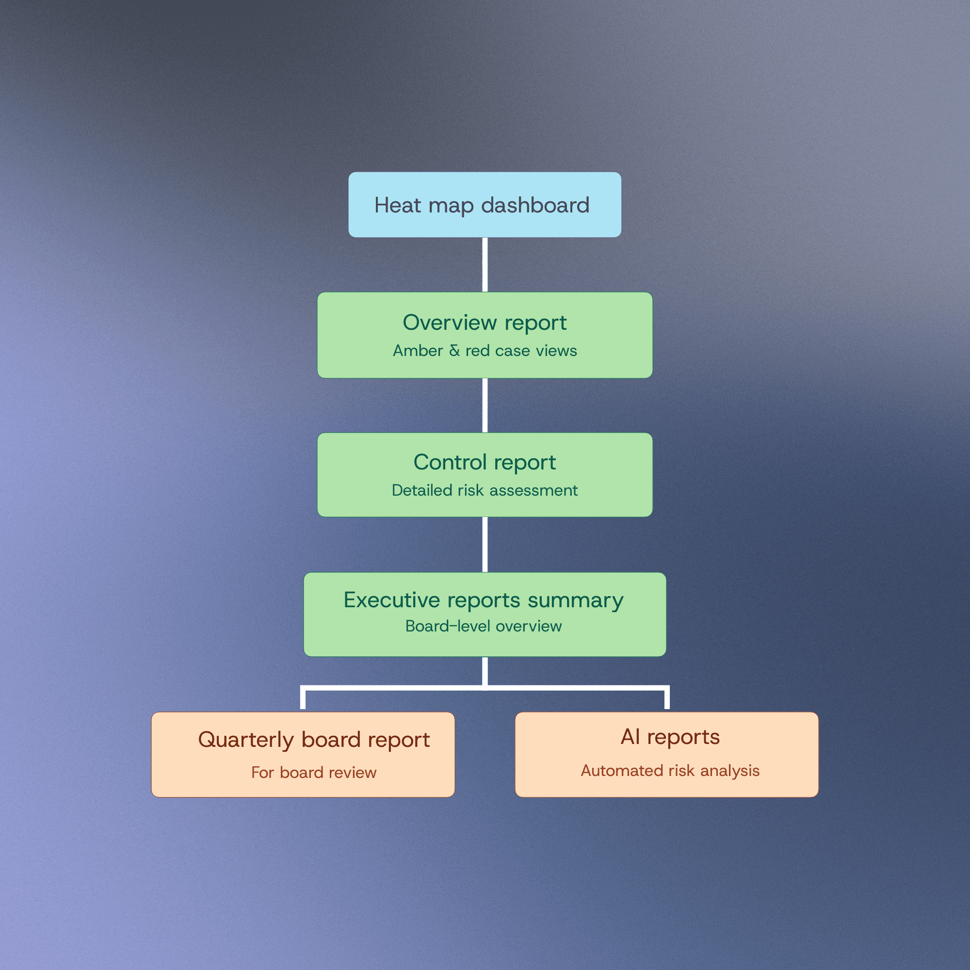
Instead of asking users to adapt to the interface, I designed the interface around the mental model they already trusted.
The Heatmap
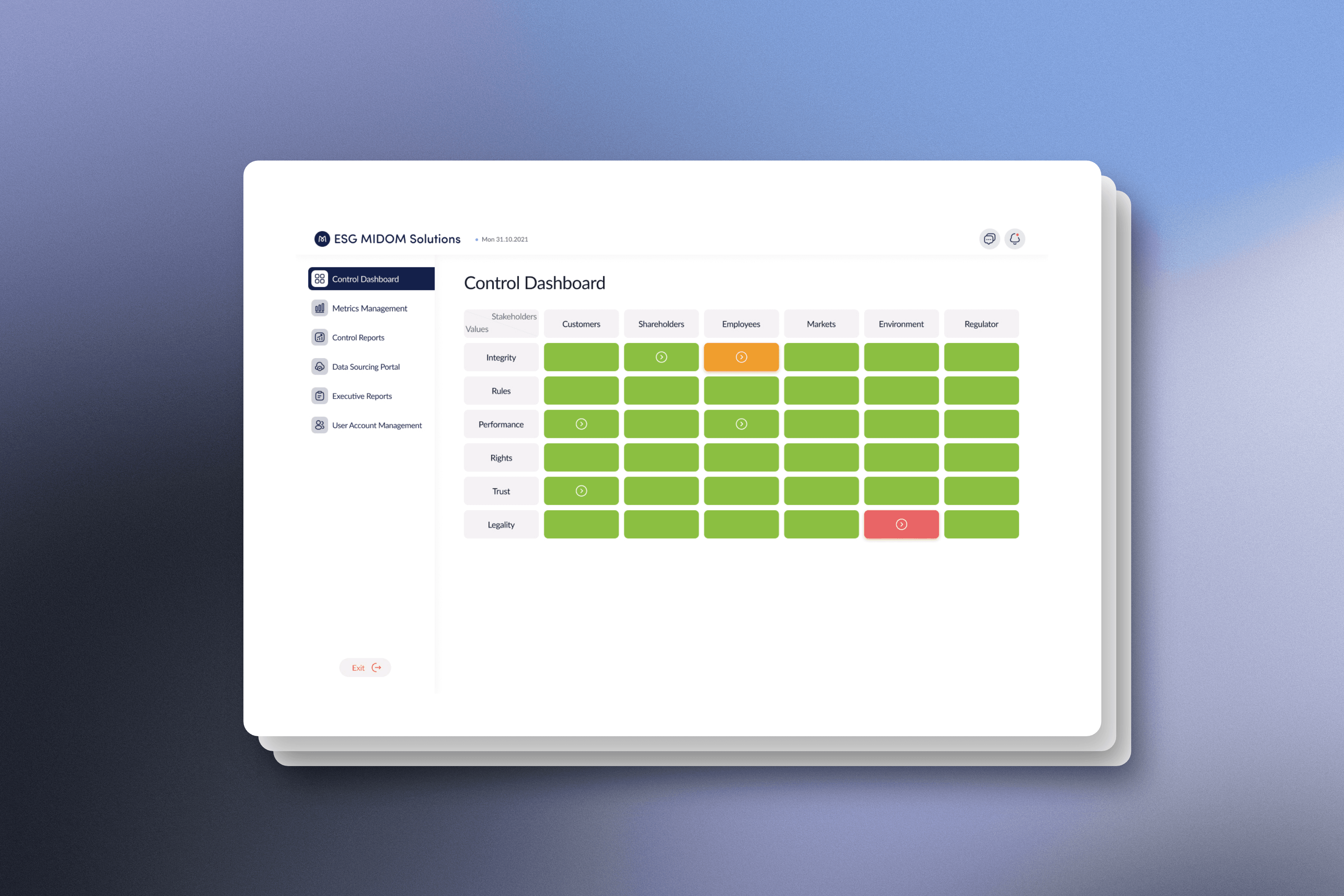
People shouldn't have to interpret risk. They should see it.
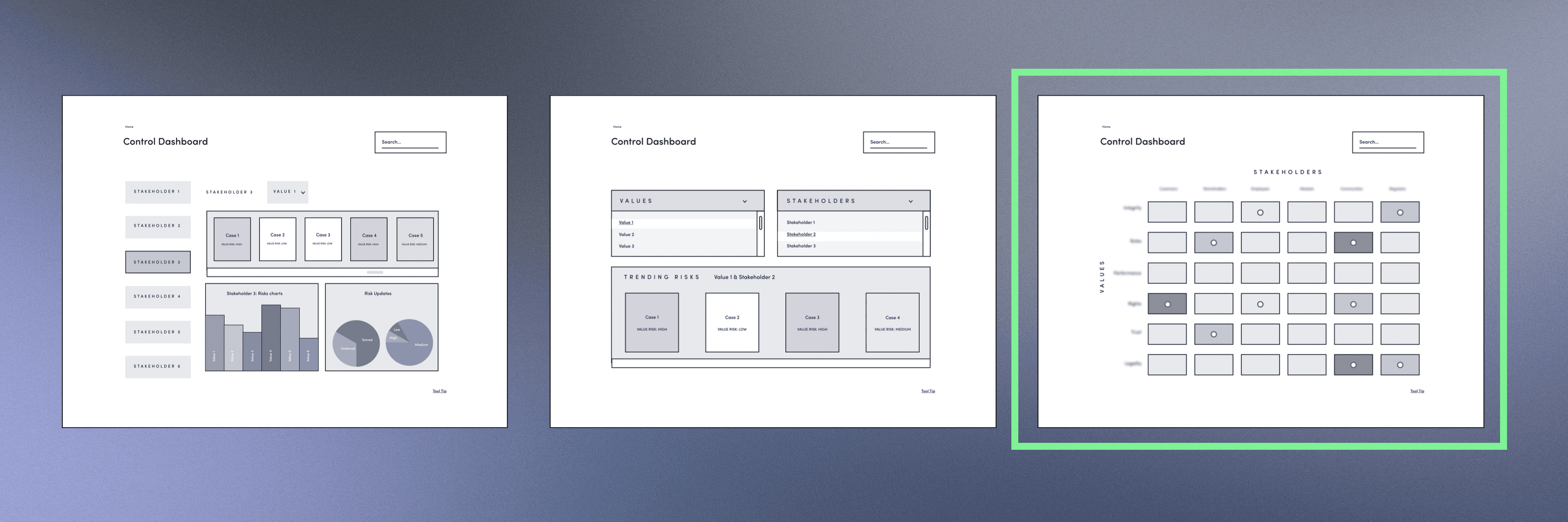
One of the biggest design challenges was presenting risk in a way people understood instantly. We explored charts, scorecards and list-based dashboards, but every approach asked users to stop and interpret the information before they could make sense of it. During research, one insight kept appearing: risk managers naturally think about risk as a relationship between likelihood and impact.
The resulting heatmap made patterns immediately visible. Users could spot high-risk areas, understand priorities and identify emerging issues within seconds, turning complex governance data into something intuitive at a glance.

Clients
The Pivot
Sometimes removing a feature creates a better product.
Early concepts included an in-app chat feature to improve collaboration between teams. As development progressed, it became clear the feature was consuming a significant amount of engineering effort without adding equivalent value for users. Rather than protect the original idea, I revisited the problem we were trying to solve.
Replacing chat with the lightweight notification system we already had in scope kept people informed, maintained visibility across cases and dramatically reduced development effort. Protecting the launch mattered more than protecting my own idea.
Whilst chat would have been great for MVP our notification system provided the value of awareness without the added dev time.

Design System
The product was developed by a distributed team, making consistency just as important as usability.
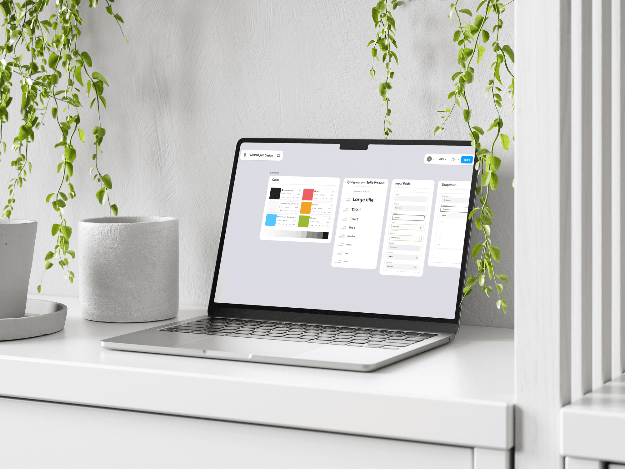
I created a comprehensive design system covering navigation, components, interaction patterns and visual language, giving designers and developers a shared foundation to build from. It reduced ambiguity, sped up delivery and ensured the product remained consistent as new features were introduced.
Rather than becoming harder to maintain as it grew, the platform became easier to evolve.
Fostering trust and communication with the dev team meant sharing a design foundation led to quick builds and consistency.

The Outcome
MIDOM is currently in development, with launch planned for 2026.
The project challenged me to balance user needs, business priorities and technical constraints within a complex domain.
More importantly, it reinforced that good product design isn't about adding more functionality, it's about making the right information available to the right people at the right time.