
Overview
Vanarama had a strong brand, a large vehicle catalogue and high search traffic, but customers weren't progressing through the leasing journey.
The issue wasn't a lack of choice. It was a lack of confidence. I redesigned the search-to-lease experience around a simple principle: every stage should answer the next question a customer needs answered before they're ready to commit.

The Challange
Leasing a vehicle is a series of decisions.
Customers first need to find a vehicle worth considering, then decide which model is right for them, before finally feeling confident enough to place an order. The existing journey treated every page as a catalogue. It presented information, but rarely helped people make decisions.
The challenge was to redesign the journey so every step built confidence for the next.
The Solution
Rather than redesigning three individual pages, I redesigned one connected journey.
Research showed each stage had a different responsibility. Search should help customers discover relevant vehicles. The derivative page should make choosing between models effortless. The product page should remove the final reasons not to commit.
Designing around those decisions created a simpler experience that reduced friction from search through to checkout.

Asking Questions
The project began by mapping the decisions customers were trying to make rather than the pages they were visiting.
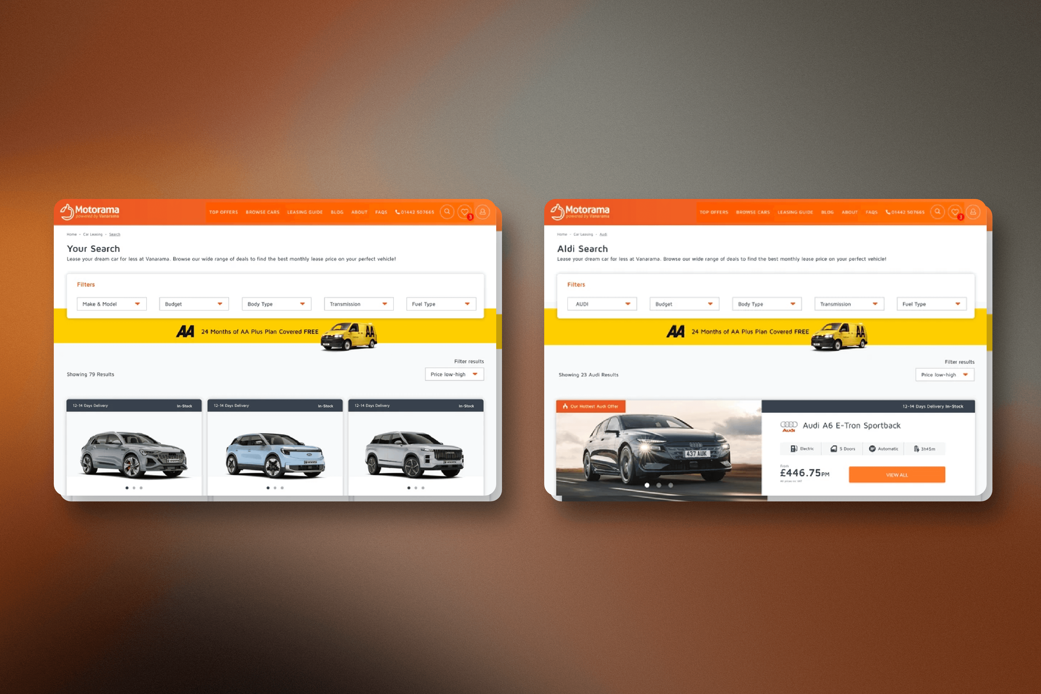
Search needed to answer "Is this worth looking at?" so I surfaced delivery information, key specifications and filtering much earlier. The derivative page needed to answer "Which one is right for me?" so I introduced imagery, comparable specifications and clearer visual hierarchy that made variants easy to compare.
Finally, the product page needed to answer "Am I ready to order?" Trust signals, delivery information and a live order summary removed uncertainty, while anything that distracted from commitment—including recommended vehicles—was deliberately removed.
By giving every page a single purpose, the entire journey became easier to navigate.

Search Results
Users browse vehicles
Can I find a vehicle worth considering?
Requires specs, availability, delivery time, and filtering at card level
Derivative Page
Users explore vehicle groups
Which variant is right for me?
Requires imagery, comparable specs, and a decision anchor
Product Page
Users opens vehicle details
Am I confident enough to commit?
Requires social proof, process clarity & summary that builds as they configure

Organised Information
Research revealed customers weren't struggling to use the interface, they were struggling to find the information they needed.
Delivery times were the biggest driver of support calls, key vehicle specifications were hidden behind additional clicks, and users often abandoned before comparing variants because too much effort was required. Instead of adding more content, I reorganised the experience around the information customers looked for first, making important details immediately visible and reducing the effort needed to compare vehicles.
The result wasn't more information. It was better timing.


Confidence Not Clicks
By the time customers reached the product page, browsing was no longer the goal. The interface shifted from helping users explore to helping them commit.
A two-column layout separated vehicle information from configuration, allowing customers to build their lease while always understanding the impact of their choices. Trustpilot reviews, delivery information and key specifications appeared exactly where uncertainty was most likely to occur.
Every element had one job: remove a reason not to continue.


The Outcome
The redesign launched as an A/B test and outperformed the original journey across every key measure.
increase in visits to product pages
reduction in search page bounce rate
increase in derivative page engagement
reduction in delivery-related support calls
Reusable CMS components added to the design system for future campaigns